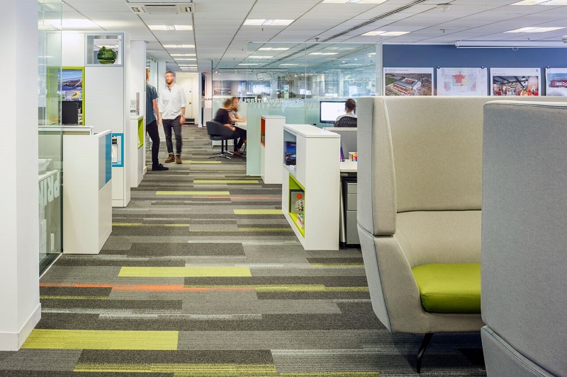
Carpet tiles from global modular flooring specialist, Interface, have been used by leading architecture and design practice, KSS, to inject a splash of colour to its central London offices in honour of its 25 years.
Working across multiple sectors, KSS welcomes a large number of guests every day for meetings and workshops. Therefore, the company wanted to create a striking office design that was inspiring and showcased its creativity, as well as reflect the attention to detail that the organisation prides itself on.

KSS decided to revitalise its office by updating the central spine of the studio, leading from the main reception to the desks and meeting rooms. The firm wanted to create a bold walkway with colourful flooring that would draw visitors into the space. It turned to Interface to find the perfect products for its needs.
Claire Wilson, Associate at KSS, explained: “We’ve worked with Interface on a number of projects in the past, so we knew the company was the right choice for updating our own office design. Its product portfolio offers lots of choice in terms of square and Skinny Plank tile formats, along with extensive vivid shades and striking textures.
"As a result, our team had plenty of scope to be creative when brainstorming design ideas, while also ensuring the chosen scheme fitted in with the existing finishes.”
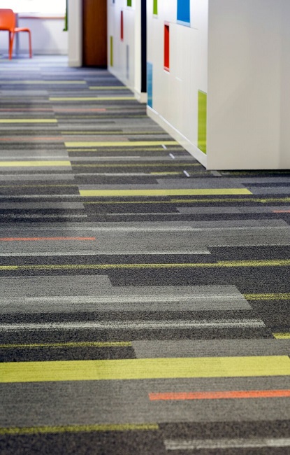
Claire and her colleagues selected Skinny Plank shaped tiles from Interface’s On Line and Off Line collections, both of which offered products in a wide range of shades that complemented those used for the KSS brand.
Planks of lime and several shades of grey from the On Line collection were fitted in the walkway. A selection of three, two-tone tile products from the Off Line collection were interspersed across the floor.
Each one graduated in colour from dark grey to accent shades, including grey-blue, lime and bright orange. The greys blended the new scheme with the flooring used elsewhere in the office, while the bold colours helped to define the walkway as a distinct zone in the space. The planks were laid at a right angle to the direction of the walkway, making the area feel wider and more spacious.

Debbie Brant, Associate Director at KSS, concluded: “The walkway is the first part of the office that both clients and staff see, so it’s important that the design of the space makes a good impact.
"The new flooring does just that – it injects colour and helps to make the office feel more open, thanks to the way the planks have been laid. All of this has helped us create a space that gives the best possible impression to visitors.”


